Please note that the following was submitted for a university assignment. I got 68/100 (two marks from a first), which helped me make up for my awful marks for E-Business and Human Resource Management (44 and 41). While researching about Sacha Vierny on the internet, there was only one or two articles, so I decided this was good enough to post as he is a remarkable cinematographer that needs more recognition. There is a reason I chose him as oppose to the fifty, or so, more recognisable cinematographers and thats because the visuals in every one of his films is flawless. Without further ado, here it is:
Cinematographer Analysis-Sacha Vierny
For
Cinematography Assignment 2, I had to “research the work of a particular
cinematographer and produce a study that analyses the working practices and key
aspects of the cinematographer’s style”. The cinematographer I chose was Sacha
Vierny. Throughout his career, he worked briefly with Luis Bunuel, Agnes Varda,
although his main collaborators were Alain Resnais and Peter Greenaway. He
directed films with critically acclaimed and avant-garde film directors,
purposely to stay away from the Hollywood mainstream. He has a tremendous love
of his work, and is notable for his dark lighting and his experimentation with
styles. He experiments with all of his films, using improvised techniques and
styles. ‘Hiroshima Mon Amour’ is his first notable feature length film, and his
first collaboration with Alain Resnais. However, their most iconic
collaboration would be on ‘Last Year in Marienbad’ in 1961.
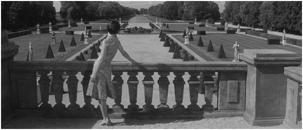
(Figure
1, Last Year in Marienbad, 1961)
This
screenshot is taken from Vierny’s second film with Resnais titled ‘Last Year at
Marienbad’. After ‘Hiroshima mon Amour’, Resnais was an established auteur,
with an ambition to experiment. His films include scattered narratives, a plot
equivalent to a puzzle, and a mixture of dreams and reality. Vierny had to
convey all of this in the cinematography. The first aspect which is notable
from the image above is the depth of field. Resnais (2001) said “he was using
auxiliary lenses to get more depth of field than would have otherwise been
possible”. Vierney used auxiliary lenses to increase the depth of field far above
the standard for the industry, creating shots where the character is in focus
in the foreground, while the sculptures and trees are in focus in the
background. As unusual as this technique is, it adds to the dream-like
aesthetic of the film.
The shot
doesn’t look realistic, with the strange shaped trees and the endless path. More
of a sketch than a camera shot. What adds to the abstract of the shot was the
decision to shoot black and white. This was not a budgetary decision, but an
artistic vision as Freeman (2007) states “black and white allows more
expression in the modulation of tone in contemporary texture, the modelling of
form and defining shape”. The texture and detail of the inside of the Baroque
mansion, and the vast gardens would be invalid in colour. Black and white was
used between 1900s-1950s, and induces nostalgia into the viewer. The past and
distant memories are what ‘Last Year in Marienbad’ is all about.
Over-exposure is another technique Vierny used in ‘Last Year in
Marienbad’. The bright white colours add to the mise-en-scene of the film.
“In
style Marienbad is finely appropriate to its context. The use of over exposure,
rapid cutting to break down the normal temporal order and to juxtapose related
scenes and gestures, are obvious and quite literal representations of the
activities of memory, particularly its associative functions”
(Ward,1968)
The unconscious memory differs
from real life in many ways. Altering the exposure of the film, creates an
unrealistic and uncomfortable atmosphere, which is perfect for a film like ‘Last
Year in Marienbad’ due to the obscure narrative and the unclear remembering
structure of the script.
Combining
the lighting with the staging creates a distinct uncomfortable atmosphere. Sutton (2009) agrees with this and says “Vierny and Resnais manage to exploit
the flatness of photography on-screen, using careful techniques of staging and
foreshortening as well as exquisite lighting and sensitive film stock”. The
film has a style copied by films like Stanley Kubrick’s ‘The Shining’ and music
videos like Blur’s ‘To the End’.
(Figure
2, A Zed and Two Noughts, 1986)
In 1986,
Vierny worked on his first film with Peter Greenaway, A Zed and Two Noughts.
From the first shot, Vierny presents many of the techniques he would use in the
next sixteen years, with Greenaway, his second major collaborator. The shots
are planned before recording, and symmetry is an important aspect. The letters
‘Z’, ‘O’ and ‘O’ consume precisely equal amounts of the frame, with vertical
pillars dividing through each letter. The composition of their work is filled with
shots of the subject being in the centre of the frame, with a prop, or an actor
further back to the far left or right. The four intersections that the Rule of
Thirds create, land exactly on the centre ‘O’. Despite this being a well
composited shot, I feel there is too much for the viewer to look at. The
spectator’s eye is not drawn to a specific part of the shot, but all of it so
the spectator can choose where to look on screen.
Greenaway
and Vierny experimented with many different light sources during the filming of
A Zed and Two Noughts. Greenaway (2003) spoke about this and stated “We [Vierny
and Greenaway] played games with the notion of light, about its source and how
it works. We sat down and made a list of 26 different ways we could light a
set”. All 26 methods of lighting are visible in A Zed and Two Noughts, which
ranged from bonfires, candles and cathode-ray tubes to heat cameras and a
rainbow. During the film, they experimented with natural, artificial,
contemporary and industrial light sources that resulted in a distinct and
unusual effect that strengthens the core ideas of the film. The film feels
unnatural and fake due to the natural world being vacant from his films.
Lawrence (1997) compares him to Resnais on this factor and says “As much a
romantic in his way as Resnais, Greenaway persists in the hope for a natural
world. Behind this death, evil and mediocrity is the natural landscape. The
desire to believe reinforced by the knowledge that such a thing does not
exist”. The characters are trapped in an
artificial and claustrophobic prison, which Vierny and Greenaway both created.
“The
cinema is routed, as it is in photography, tends heavily toward illusionistic
realism, and the allegorical material Greenaway includes usually proves
disruptive to the viewer’s illusion that a meaningful world is unfolding”.
(Willoquet-Maricondi,
2001)
The material
and the atmosphere create an illusion that the characters are living in a dream
grounded in reality, similar to Resnais’s ‘Last Year in Marienbad’. The illusion
continued in all of Greenaway and Vierny collaborations.
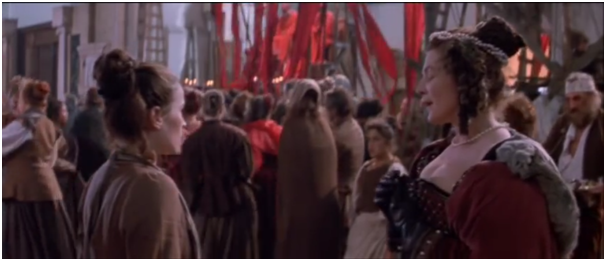
(Figure
3, The Baby of Macon, 1993)
Many of
Greenaway and Vierny collaborations include the colour red. None of them more
than ‘The Baby of Macon’, which has the colour red in nearly every shot whether
in the foreground, background or costumes. The storyline chronicles the life of
a baby who is believed to be the messiah, but human greed and corruption
exploits the baby. Greenaway’s aim
appears to be to offend, with detestable characters, exploitive violence and a
director who insists on breaking the forth wall constantly throughout. What
Vierny does to support this aim, is to inject the majority of shots with the
colour red and to not include a single close-up in the whole film. Greenaway’s
intention of reminding the audience that the characters are acting in a play on
stage is apparent with scenes including the play’s audience, and even scenes
where they interact with the play. Vierny’s excess of medium to long shots
reminds the viewer they are looking at a distance, similar to a play, rather
than a film.
(Figure 4, The Cook, the Thief, his Wife and her
Lover, 1989) (Figure 5, Samson Le Mariage Et L
Enigme,dresde 1638, Rembrandt)
(Figure 6, The
Draughtsman’s Contract, 1982)
(Figure
7, The Night’s Watch, 1642, Rembrandt)
(Figure
8, The Baby of Macon, 1993) (Figure 9, Danae, 1636, Rembrandt)
The films Vierny and
Greenaway collaborated on in the 1980s-90s were visually inspired by the
paintings of Rembrandt. Shown above, are comparisons between Rembrandt’s
paintings in Greenaway/Vierny’s films, whether it is the framing of the top image,
the costumes of the middle image or the tones and colours of the bottom image.
Their films feel like, they were made in the seventeenth century. Vierny’s
early style was similar, with the architecture in ‘Last Year at Marienbad’
being Baroque, but lacked the dark colours and the Rembrandt style of his
Greenaway work. He has evolved stylistically during the 46 years of making
films.
All of
Vierny’s work is concerned with experimenting with colour and lighting. Whether
this is the control of the black and white and overexposure used in Resnais’s
‘Last Year in Marienbad’, or the large amount of different light sources used
in Greenaway’s ‘A Zed and Two Noughts’.
His style has improved and differed over the decades, but he has always
experimented with every one of his films.
Bibliography
Alain Resnais (October, 2001). ‘The Elegance of Sacha Vierny’ in ‘Positif’.
Issue 488, page 44. Accessed on 25/03/2014.
Amy Lawrence, 1997. ‘Chapter 2’ in ‘The Films of
Peter Greenaway’ pg62. Accessed on 24/04/2014.
Damian Sutton (2009). ‘Cinema’s Photographic View’
in ‘Photography, Cinema, Memory: The
Crystal Image of Time’. Page 127. Available at http://books.google.co.uk/books?id=mhBic-4p3WUC&pg=PA127&lpg=PA127&dq=sacha+vierny&source=bl&ots=TxHMno82V_&sig=nZrXdPadAO3il9pEs4WOG_4NUHs&hl=en&sa=X&ei=iMIsU_qWFseJ0AXlqYC4DA&ved=0CKsBEOgBMBE4KA#v=onepage&q=sacha%20vierny&f=false. Accessed on 21/03/2014.
Figure 1. Last Year in
Marienbad (1961). From: Studio Canal. Directed by Alain Resnais. [film still].
Accessed on 24/04/2014.
Figure 2. A Zed and Two
Noughts (1986). From ........... Directed by Peter Greenaway. [film still].
Accessed on 20/04/2014.
Figure 3. The Baby of
Macon (1993). From Allarts. Directed by Peter Greenaway. [film still]. Accessed
on 12/04/2014.
Figure 4. The Cook, the
Thief, his Wife and her Lover (1989). From Vendex. Directed by Peter Greenaway.
[film still]. Accessed on 25/04/2014.
Figure 5. Samson Le
Mariage Et L Enigme, dresde (1638). Painted by Rembrandt Harmenszoon van
Rijn. Accessed on 13/04/2014.
Figure 6. The Draughtsman’s
Contract (1982). From British Film Institute/Channel 4. Directed by Peter
Greenaway. [film still]. Accessed on 25/04/2014.
Figure 7. The Night’s
Watch (1642). Painted by Rembrandt Harmenszoon van Rijn. Accessed on
13/04/2014.
Figure 8. The Baby of
Macon (1993). From Allarts. Directed by Peter Greenaway. [film still]. Accessed
on 12/04/2014.
Figure 9. Danae, (1636). Painted
by Rembrandt Harmenszoon van Rijn. Accessed on 13/04/2014
John Ward, 1968. ‘L’Annee derniere a Marienbad’ in
‘Alain Resnais on the Theme of Time’ pg57. Accessed on 14/04/2014.
Michael Freeman, 2007. ‘Composing with Light and
Colour’ in ‘The Photographer’s Eye’ pg126. Accessed on 24/04/2014.
Paula Willoquet-Maricondi, 2001. ‘Z is for Zebra,
Zoo, Zed and Zygote’ in ‘Peter Greenaway’s Post Modern/Post Structuralist
Cinema’ pg163. Accessed on 14/04/2014.
Peter Greenaway, 2003,
‘Two Noughts- An Introduction by Peter Greenaway’ on ‘A Zed and Two Noughts’,
dvd, BFI, Stephen Street, London. Accessed on 29/03/2014.


No comments:
Post a Comment